Kitchens are often referred to as the heart of the home. It’s not hard to understand why as it is one of the busiest areas in the house. Over the years, there have been numerous changes to kitchen designs and appliances to make them more innovative, functional, and beautiful. These changes are continuous as both technology and requirements also evolve continuously. Thus, if you love kitchens, starting a business that focuses on them can be lucrative.
Whether designing new kitchens or looking for ways to redecorate current ones, some kitchen websites stand out more than others. They not only have a knack for keeping up with trends but also find a way to make it accessible and applicable to everyone. However, finding these websites can be time-consuming. Fortunately, this article lists the ten best kitchen websites of 2022 and what makes them so great. If inspiration is what you are looking for, these websites have it.
Our Related Services
- Our Keyword Research, Content Writing & Posting Service
- Our Done-For-You Niche Website Service
- Our On Demand Niche Website Service
Sign up for our newsletter to receive SEO tips, discounts and freebies.
1. Houzz
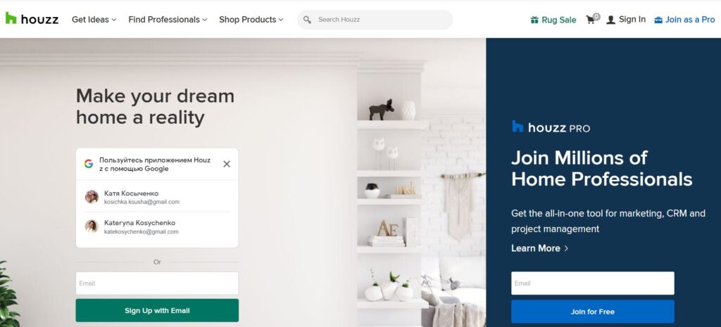
The Houzz website is a platform where people, ideas, designers, and contractors meet. Thus, people looking for home renovation ideas, particularly the kitchen, can find different pictures and service providers here. They can also check out advice and recommendations from experienced users. Houzz also functions as an online store that allows users to purchase furniture. It is a great concept and one that has been helping people all over the world.
Visitors do not have to pay to find professionals or use any design search functions on the website. However, professionals who want to be listed on the website do so via subscription services. Thus, Houzz makes money via these subscriptions and commissions through sales made on the site. It also benefits by allowing users to share photos of their renovations and designs. Hence, this increases their content without having to pay for it. Overall, the website is convenient, helpful, and popular among home enthusiasts.

What Do We Like About This Kitchen Website?
- Functionality
The Houzz is designed to be a one-stop shop. It does not only feature kitchens but everything dealing with a home. People can find ideas, designers, contractors, and specific items that will aid their renovation. Gladly, it also works just as well for professionals looking for ways to boost their exposure and expand their reach.
Everything on the website is categorized accordingly, making everything flow naturally. Evidently, they have considered people’s experiences and made sure to include everything they need, from financing to scheduling.
- Structured for Growth
The website had humble beginnings but has been obviously structured for growth. Their expansion into being a platform for more than just ideas has given them the opportunity to build an excellent reputation. This makes them a desirable association to other businesses.
Hence, brands that wish to sell their furniture and professionals seeking to reach more people capitalize on Houzz. The brand can then afford to select only the best service providers and brands. In doing so, they maintain their reputation and enable them to attract more partners.
- Content
Houzz has in-house specialists who curate content in the form of blogs, research, and magazine articles. However, they also allow designers and site users to post photos of their designs. This is an excellent way to add relevant content to the website without having to pay for it.
Visit Houzz’s website to learn more about its content and functionality.
- Income
Houzz has an excellent model for earning income. They do not charge visitors to the site. Instead, they make money by charging subscription fees to professionals who are listed on their website. However, it is not just for being listed on the site. They also provide professionals with management tools and advertising opportunities. Houzz also earns a commission for every sale made through its platform.
What Do They Do Right?
- Offer a multitude of options on one platform
- Website makes money from subscriptions and commissions
- Allow people to share their designs, thus increasing the content of the website
- The website design is excellent, with categories making it easy to navigate
- Provide input from users of the site in terms of reviews and recommendations
- Have badges and buttons that certify professionals
Website: Houzz
2. John Michael Kitchens
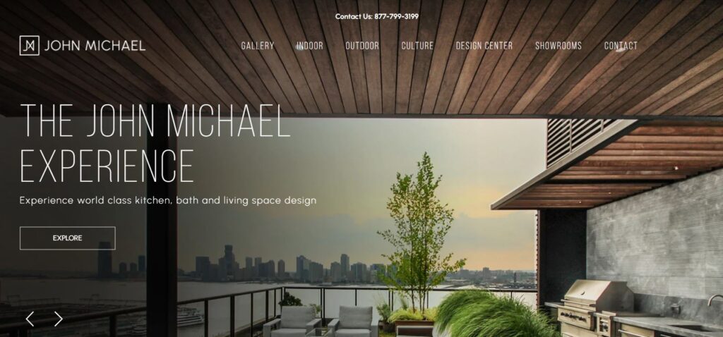
The John Michael Kitchens website is simple and elegant, reflecting the company’s aims. Visitors to the site can easily navigate between indoor and outdoor kitchen pages. This gives them a chance to see the type of work the company does and understand their work process. Besides, they also have a design center that displays various styles and color combinations available. This is a great visual representation and a handy tool for people.
The website also dedicates a page to appliance companies that they partner with. These appliances perfectly fit into the kitchen designs and can be seen on the photos page on the website. This is an excellent addition as most kitchen niche websites that focus on design only feature the images of appliances without further details. Lastly, they include information about the company, its origins, and how to contact them. There are also links to social media and a downloadable catalog for users.

What Do We Like About This Kitchen Website?
- Functionality
The website has a beautiful design and is easy to navigate. John Michael Kitchens utilize high-quality graphics, but it does not slow down the website. Users can choose the type of kitchen they want to look at by simply selecting a tab. In addition, the design center helps them explore various design possibilities. This empowers the users, allowing them to experiment with custom designs.
- Information and Imagery
The website provides a wealth of information without overwhelming the user with text. They cleverly alternate large images with text, following appropriate placement. This provides an outstanding balance of text and images for the readers. For example, there is a description of the products being made in America. This description also has an image of a factory worker with clear red, blue, and white elements reminiscent of the American Flag.
Check out their website to learn balancing imagery and text in a blog like an expert.
- Curated Appliances
The website has a page dedicated to different luxury appliance brands fitting perfectly into the kitchens they design. John Michael Kitchens highlight their years of experience and knowing which brands work best with their aesthetics. This is beneficial for both brands as it highlights the design of the kitchens and promotes the appliance brand.
- Storytelling
Throughout the website, the content provided tells the story of John Michaels Kitchens. It highlights the brand’s core values, the fact that it is made in America, and the quality materials they use. It all comes together in a way that builds brand awareness while allowing users of the site to get to know them personally.
What Do They Do Right?
- High-quality imagery that does not make the site sluggish
- Excellent website design with adequate information and not too much text
- Storytelling is true to brand
- Partnerships with appliance brands
- Allow site visitors to see what their personal choices would look like
- External links to company videos
- Links to social media
Website: John Michael Kitchens
3. Mowlem And Co.
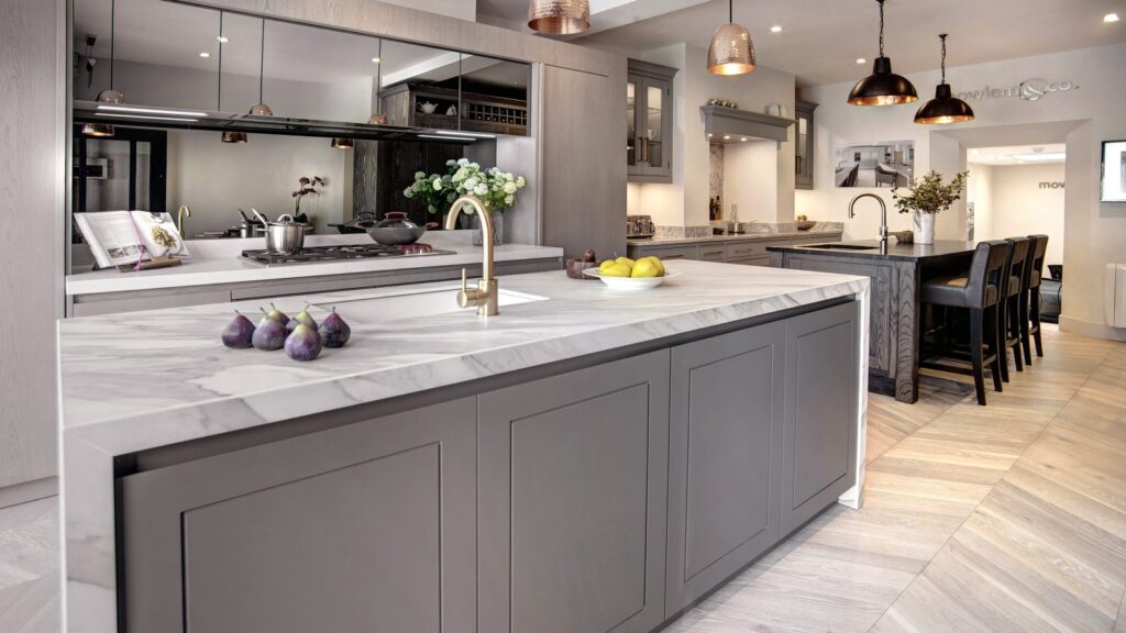
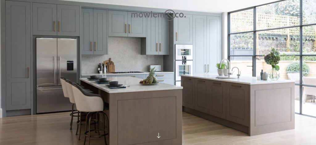
Mowlem And Co. is a UK-based company. Their website exudes luxury right from the homepage. The images throughout the website emphasize luxury and personalization. The company specializes in bespoke designs and closely works with clients to make their dream kitchens a reality. Their website has more images than text and sticks to essential information. The bulk of the info is regarding their work process and how they ensure that clients get everything that they want in their kitchen.
The website also includes a stories page allowing visitors to learn more about the company, their work, and what’s trending in kitchens. In addition, this page further highlights the company’s achievements and the times they have been in the press. Overall, the website works to direct visitors to a physical showroom rather than providing too much information upfront.
What Do We Like About This Kitchen Website?
- Stories Page
This part of the Mowlem And Co. website is a great feature for multiple reasons. Firstly, it allows visitors to see how successful the brand has been and the times they have been mentioned in the press. Secondly, it enables people to follow new trends in kitchen design. Thus, even if they cannot afford the brand, they can still draw inspiration from the website. Lastly, this section of the website also advertises when appliances are on sale from their showroom. All together, these features make the site useful to many people. If you plan to launch your own website, do check theirs out to have a better idea of how to feature a stories page.
- Social Media Links
The website has relevant links that direct people to their social media sites. Therefore, people can follow the company on social media and stay on track with trends. The company markets itself as luxury, personalized kitchens, and people who cannot afford them are still able to look at their designs.
- Images
The website features large images that are effectively used to gain visitors’ attention. The company relies on the images to convey what they are capable of and uses tags to highlight the designs that have won awards. That is why they use fewer words, ditching the boring text-filled site designs.
- Minimalist Design
The website may have quite a few images, but it is entirely free of clutter. All the short descriptions on the pages of the website reflect the brand. They work to satisfy the needs of their customers and advise them with their years of experience. The proof of their capabilities is in the images and their showrooms. Thus, the website does not need more text to explain anything further.
What Do They Do Right?
- Use images to capture attention and interest
- Redirects to social media pages for more design info
- Encourage people to visit their showrooms
- The Stories page contains trends, news, and sale items from showrooms
Website: Mowlem And Co.
4. The RTA Store
The RTA Store’s website is a one-stop-shop for all your kitchen needs. At first glance, the website can seem a bit crowded. However, upon further scrolling, you will see that it is separated into neat sections. What is clear from the content is that they cover all the bases regarding kitchens. At its core, the company is a family-owned furniture business, and the website reflects its years of experience.
Each section offers something unique and meaningful to the visitors. People can find relevance based on their requirements as they scroll through the homepage. The brand has an easy-to-follow procedure for those who want to redesign their kitchens.
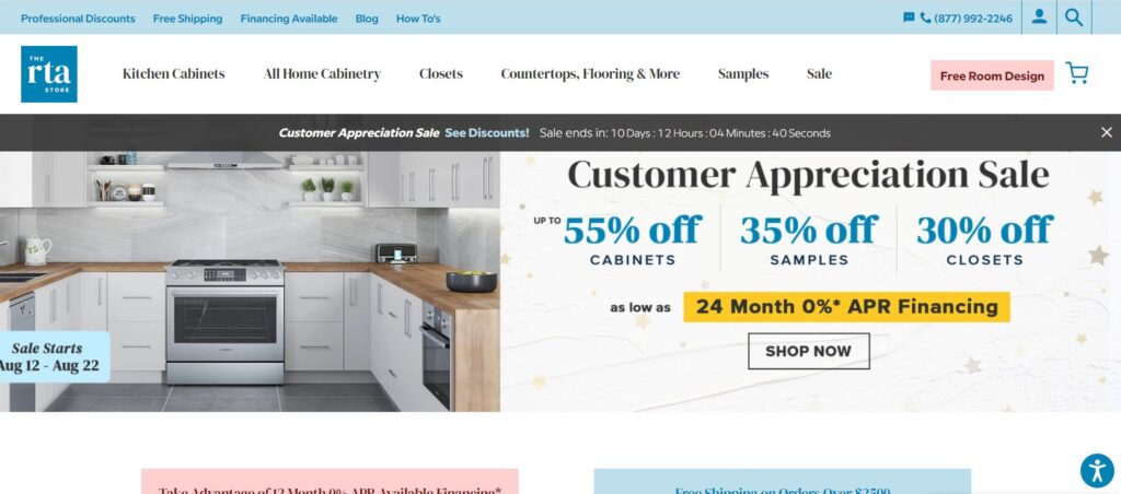
In addition, the landing page first details any available sales before showing what they have to offer. They even mention financing options so that people know they have options for their purchases. Learn more about these options from the RTA Store’s website and filter out the ones you’d like to add to your site.
What Do We Like About This Kitchen Website?
- Variety
The site serves as more than just an online store. It links to blogs and reports on ongoing trends. Thus, even if visitors to the site do not want to make a purchase, they can access valuable resources. In addition, there is a breakdown of categories at the bottom of the webpage that helps direct people to relevant sections.
- Consideration
The layout of the website and the content shows the company’s experience in the business. They have taken every aspect of kitchen design into consideration. For example, people can use the free design tool if they don’t want to hire a professional. For those who want perfection, there are experts available on the site willing to offer the best services. Visitors can also find contractors in a separate category or order cabinet samples before buying.
In addition, they understand that kitchens are expensive. Thus, they include DIY and financing options to help people reduce costs.
- Functionality
The website does offer a free room design tool that helps people design their kitchens. Not only can they see what it will look like, but they can also check the price of each item on the website. The website also cleverly uses a different color when they want to draw attention to sales and special offers. Visitors don’t have to scroll through hundreds of pages of unnecessary content. They can simply select what they are looking for in a specific category or use the search function on the website. People can also easily contact customer service by using the live chat function.
What Do They Do Right?
- They present everything on the landing page in a way that is not overwhelming
- An exceptional variety that broadens their reach
- Relevant content for non-buyers as well
- Highlight sales and special offers in a different color so that they stand out from other content
- Easy to navigate
- Each category is broken down to help users easily find specific items
- Use their experience to cover all aspects of designing and building a new kitchen
Website: The RTA Store
5. Main Line Kitchen Design
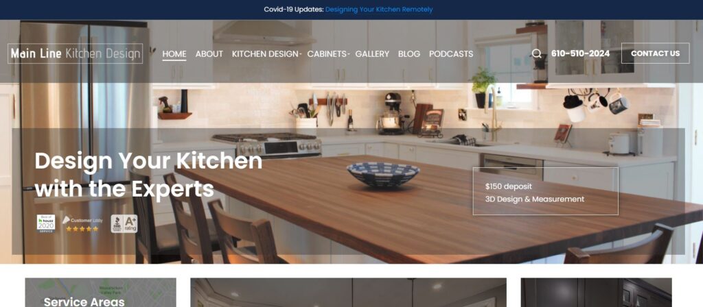
The masterminds behind Main Line Kitchen Design came together and formed a unique online concept to market their work instead of having physical showrooms. Their website is simple and informative. It emphasizes what they can do and provides links to resources like blogs and podcasts. They also use high-quality images and provide virtual tours that showcase their work.
The website does have a fair bit of text, but it provides information about the team and how they work. The homepage layout is not as clear as some of the other websites on this list, but it does provide all categories upfront. Overall, the use of virtual tours instead of showrooms and the links to outside resources makes this website stand out for kitchen designs.
What Do We Like About This Kitchen Website?
- Unique Feature
The virtual tours are an excellent way for visitors to the site to experience different kitchen designs. Along with taking a 3D tour of the kitchens, users can also view the floor plan with actual measurements. This is a much more exciting way to explore kitchen designs than just looking at pictures. The virtual tours are also off-site, meaning that it does not bog down the Main Line Kitchen design website. It is a very clever way to show their work without showrooms. It also decreases their overheads while improving the user experience.
- Encourage Engagement With the Team
Main Line Kitchen Design has a relatively small team behind it. Thus, they introduce each team leader on the website and talk about their experience in kitchen design. It adds a personal touch to the site, which is not often seen in standard kitchen niche websites that focus solely on the products. In addition, since customers have to meet with them at some point to discuss what they are looking for, it is a great way to familiarise themselves with the team.
- Partner Links
The website has links to cabinetry brands that they use. This also allows visitors to look into the specifics of kitchen design further. Likewise, these brands also have links that lead users to the Main Line Kitchen Design website. It is a great partner relationship, and this practice is often seen on many kitchen affiliate websites. It works as a win-win situation for both websites as it boosts traffic. If you are not sure how it’s done, check out Main Line Kitchen Design.
What Do They Do Right?
- Virtual tours are a unique feature that encourages user interaction with the website
- Introducing the team to allow people to get to know them
- Links to outside resources
- Links to the brands they use
- Reviews and testimonials on the website
- Have their own trends blog, YouTube channel, and podcast
Website: Main Line Kitchen Design
6. Inspired Kitchen Design
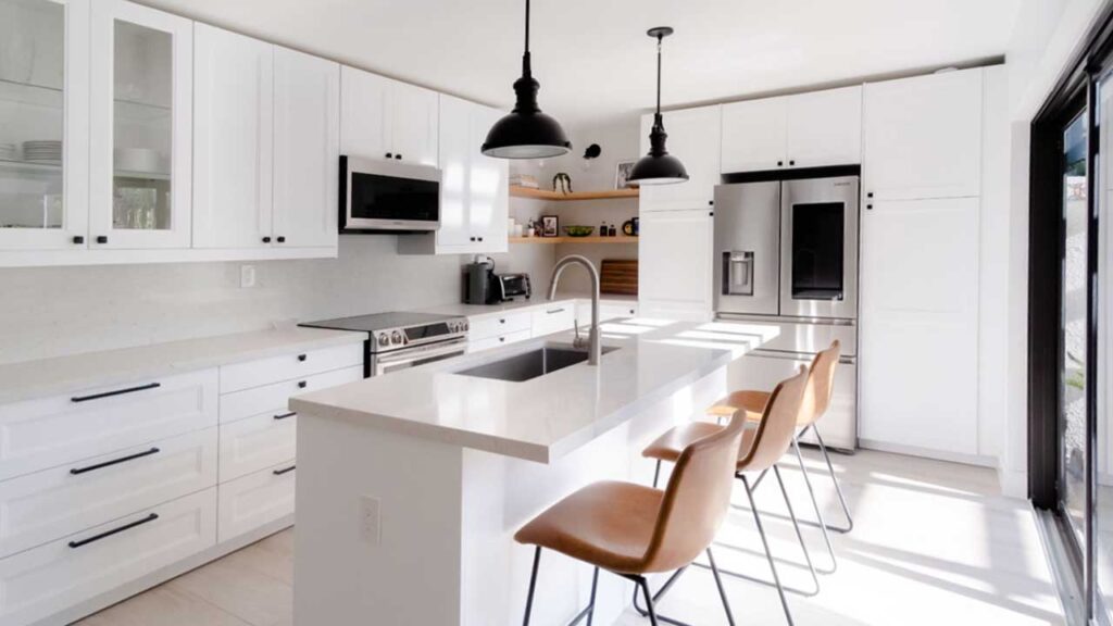
Inspired Kitchen Design classifies as a kitchen niche website as it focuses solely on one thing, and that is helping customers with IKEA kitchen designs. They have no affiliation with IKEA but work with people who want to make the most of their kitchens. The website is simple, easy to navigate, and contains a fair amount of information. They include a gallery of past projects and an overview of their design packages.
This uncomplicated website works great for all kinds of users. Short videos and brief descriptions help users understand how the company works. In addition, Inspired Kitchen Design only consists of eight people. Therefore, they can afford to introduce each team member. This feature tells people who they might be working with to design their kitchen.
What Do We Like About This Kitchen Website?
- Simplicity
Inspired Kitchen Design keeps its website simple and sophisticated. Everything is well presented on the homepage. Whether you choose to use the company’s services or not, you can still look at the designs in their gallery. In short, they have presented all the necessary information without cluttering the interface. Check out their website to better understand how you can adopt this strategy and benefit from it.
- Niche Services
The company is very clear about who they are and what they do. They took their years of experience and developed a concept that helps thousands of people. Inspired Kitchen Design capitalizes on its unique knowledge of dealing with IKEA cabinetry and specialized service. Even though they have no official affiliation with IKEA, they still benefit from each other. Inspired Kitchen Design uses IKEA’s offering to its advantage. People still order their cabinets from IKEA, but having help in planning the design and finalizing measurements is a massive help.
- Marketplace Function
In addition to offering its design services on the website, Inspired Kitchen Design also allows people to connect with IKEA installers in their area. This is an excellent service as people are allowed to use the design they receive from Inspired Kitchen Design to get a free quote from multiple installers.
Furthermore, they can even use the service to connect with an installer that can help them do all their kitchen measurements before requesting help with the design. This feature on the website is handy for people who are hesitant about attempting the renovation on their own.

What Do They Do Right?
- Do not complicate the website with unnecessary information
- Have informative videos which replace text
- Offers Install Connect Service free of charge
- Show examples of past projects
Website: Inspired Kitchen Design
7. Kitchen Magic
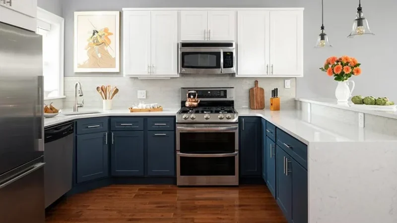
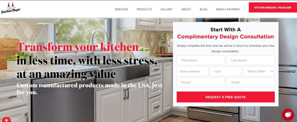
Kitchen Magic is a family-owned business specializing in cabinet refacing, and kitchen remodels. They provide a service that enables people to remodel their kitchens affordably. This niche website is an excellent example of doing things simply but expanding steadily. The company does not work with any other service providers but does have a referral program that ensures that its customer base steadily grows.
The website shows Kitchen Magic’s previous work and provides an excellent gallery of images. They detail what work was done on each project so that visitors to the site know what work and materials each remodel exactly requires. Overall, it is a great example of a kitchen website that offers a single service but is also able to gain more customers by getting others to advertise for them.
What Do We Like About This Kitchen Website?
- The Detail
The Kitchen Magic website includes an incredible amount of detail regarding the company and its services. It does so in a way that is not overwhelming and does not contain a massive amount of text. For example, they utilize steps to describe how the website works. In addition, they categorize all the images in their gallery, making it easy to filter and find what you are looking for.
- Referral Program
The referral program entails registering your email address to the referral program for free. After that, once your account is set up, you can refer friends to Kitchen Magic. In return, the referred friends receive a discount, and you get a commission for their purchases. This is an excellent way for the company to obtain new clients without advertising, thus saving money. Visit Kitchen Magic’s website to take notes on how it’s done.
- Blog
The Kitchen Magic blog is an excellent inclusion to the website as the content attracts more visitors. Even if they have no intention of using their services, visitors can get updates on trends and how to design or remodel their kitchens. People can also subscribe to the blog so they do not miss out on updates. Once they have subscribers to the blog, they will have people to suggest registering to the referral program too.
- Testimonials
The website has video testimonials that help build brand reputation and add a personal touch. People can hear what others have to say about the service and don’t have to look for reviews elsewhere. It also helps potential clients answer some questions they may have about the process.
What Do They Do Right?
- Stick to what they know
- Provide sufficient information that will help visitors whether they use their services or not
- Helpful blog for trends and tips
- Utilize referral program to generate traffic and increase sales
- Uncomplicated web layout
- Provide reviews and ratings that build a reputation
- Lists their services on other platforms
Website: Kitchen Magic
8. Home Stratosphere
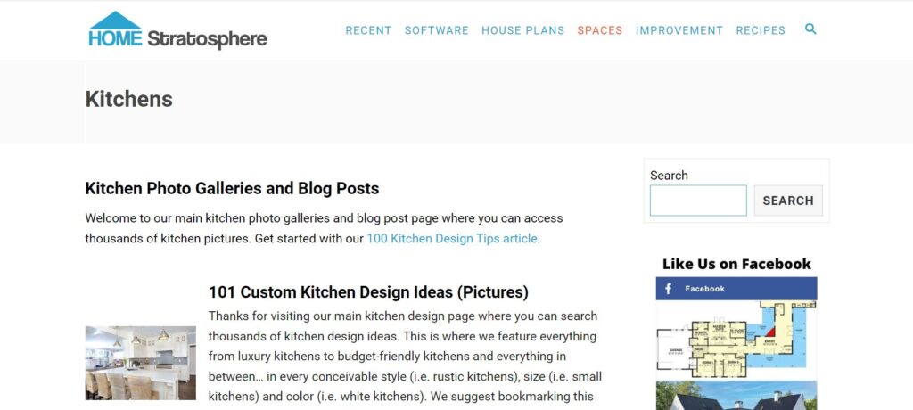
Home Stratosphere is an award-winning website. They focus on everything dealing with home design, including kitchens. The website has a variety of categories that help individuals find everything they are looking for. They even have kitchen design software that can help you with your kitchen remodeling.
Home Stratosphere partners with multiple brands and experts. In addition, they are an affiliate website that features products and services from others. The website considers everything a person needs, from budgeting to tools. Their blog has won multiple awards over the years for its excellent content. Overall, the website delivers on content and serves as a perfect example of how affiliation can be profitable if done right.

What Do We Like About This Kitchen Website?
- Excellent Content
Home Stratosphere comprises a team of writers and editors. The blog has multiple topics that all relate to home improvement and provide excellent tips, reviews, and recommendations. They take time to curate a unique collection of the necessary information. With regards to kitchens, in particular, they include everything from start to finish. There is even a tab that features recipes you should try in your new kitchen. This is done for every room in the house and even the exterior. Thus, whether you are looking for inspiration or specific services, you can find them on this website.
- Affiliations
The website has multiple partners they work with to produce content. In addition, they are affiliates of Amazon and Houzz. This is an excellent way for the blog to earn an income. Affiliates have to be very creative with their content to make enough sales and earn. Needless to say, Home Stratosphere has set the bar really high in this term. Learn the art of affiliation from them and make money through your own kitchen blog.
- Unique Features
The website offers several unique features that would not be possible without its partnerships. They have free design software that enables people to design their kitchens. It allows them to develop the floor plan, choose accessories, and even the type of kitchen they want.
In addition, the website also offers custom graphics that others can use in their own kitchen websites. Home Stratosphere also has specific categories like kitchens for tiny homes and container houses. It also lets people get a look at celebrity homes and castles for inspiration.
- Links to Social Media
The website includes links to all their social media accounts. This also consists of the company’s YouTube channel. They encourage people to follow them on these platforms to stay connected to their updates. In this manner, they also increase their followers and gain insight into their target audiences. Thus, Home Stratosphere’s writers know what content to include on the blog.
What Do They Do Right?
- Invest in great writers that provide excellent content
- Partner with brands with similar target audiences
- Feature affiliate products and services throughout the website
- Have unique features like novelty graphics and design software
- Build a loyal following by offering content like recipes and sneak peeks into celebrity homes
Website: Home Stratosphere
9. Homify
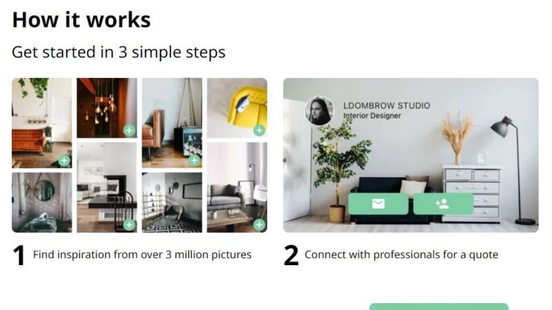
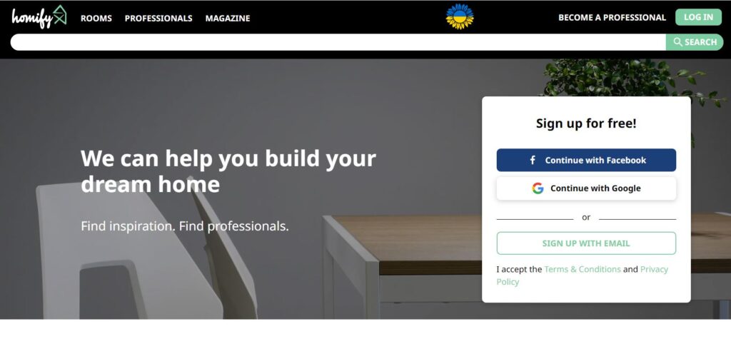
Homify is a simple website that provides design inspiration and connects people to professionals that can help them. They earn by charging a subscription fee to professionals on their premium membership. There are only four tabs on the website. One that displays images of rooms, the second connects with professionals, the third allows browsing through the magazine, and the last one describes how to get listed as a professional. This approach comes from their clear focus on connecting professionals and those seeking their services.
Homify is available in multiple countries, and the content changes slightly to better suit the location. For example, the content of the DIY articles is different depending on what is popular in the country. It means they have a global team and network of professionals in each country. This is a clever way to tailor the website to its target audience in different countries. It also gives professionals a much wider reach as people in other countries may contact them about their designs.
What Do We Like About This Kitchen Website?
- Functionality
The website is straightforward. You can use the search bar to find what you are looking for or simply select an option from the page. They separate their content according to rooms, professionals, and the magazine. Thus, visitors can easily find what they need.
Furthermore, they provide information and tips on what to look for when choosing designs for inspiration in each room. For example, regarding kitchens, they explain the different types of kitchens, how to budget, what to consider in the design, and what appliances will suit the design.
- Content
Firstly, the website contains a large amount of relevant content that attracts users to the magazine. The content can be helpful to both the users and professionals who use the website. Secondly, the fact that the content is different depending on location shows that the company considers visitors’ individual needs. What is popular in kitchens in Hong Kong may not apply to kitchens in Mexico.
Lastly, all the images on the site are provided by professionals on their network. This means that the website does not have to pay for photography. Therefore, the more designers on the network, the more original content they will have to offer. Visit Homify to pick creative content ideas.
- Professional Network
The network of professionals on the website is not just anyone who subscribes. Homify first vets their information before allowing them as a professional on the site. Furthermore, professionals on Homify often contact each other to work on a project. For example, an interior designer may find a kitchen planner they would like to work with. Thus, professionals benefit not only by gaining more clients but also by meeting potential collaborators.
What Do They Do Right?
- Uncomplicated website
- Earn an income by charging subscription fees
- Use high-quality images
- Provide information, tips, and recommendations
- Ensure they have location-tailored content
Website: Homify
10. Kitchen Universe
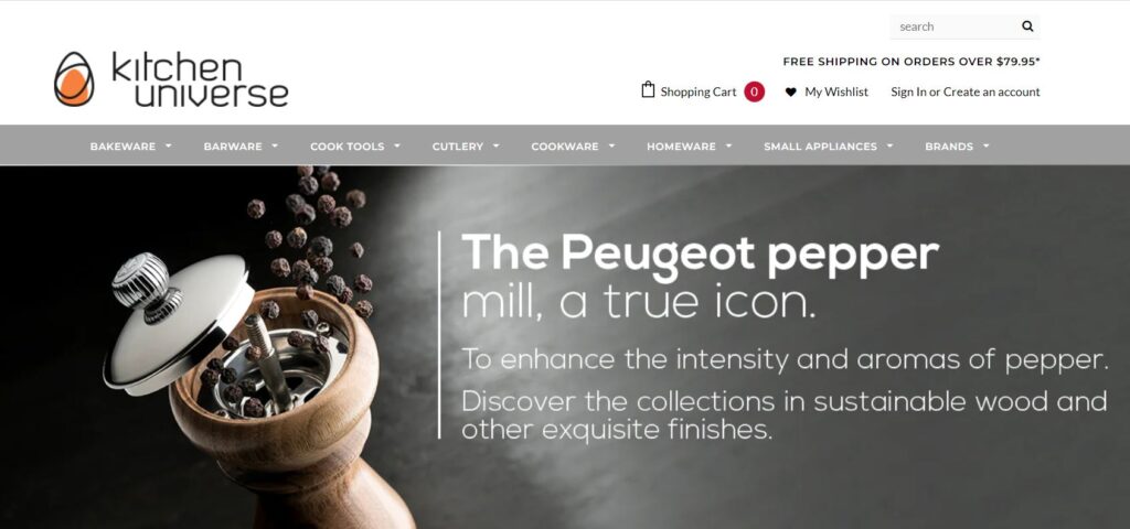
Kitchen Universe is a company that supplies kitchenware. They have every item an individual needs to stock in their kitchen, from cutlery to appliances. The website has an excellent variety of products and brands. Thus, if people are looking to fill their new kitchen, this online store has everything they would require. The company offers an affiliate program to other brands that have the same target audience like them.
The website also has an informative blog that expands its reach by discussing all things kitchen-related. It refers not only to the products they stock but also to how different kitchen designs suit various kitchen appliances and kitchen trends. They even include different recipes.
What Do We Like About This Kitchen Website?
- Variety
There are numerous kitchen products available on the website from several brands. Thus, no matter what you are looking for in the kitchen, you will find it on this website. The fact that they have multiple brands available also means they cater to different budgets. This consideration of the online store makes it easy for individuals to buy everything in one place. They don’t have to source other brands or products on different websites and pay separate shipping fees. In addition, variety also means that it will suit different kitchen designs.
- Affiliate Program
The affiliate program is a clever way for this kitchen niche website to increase traffic and sales. They offer this program because they understand that the kitchen industry comprises many niche services, and all have the same target audience. Thus, an affiliate program provides an excellent opportunity for Kitchen Universe to reach more people.
For example, chefs who use knives purchased from their site could mention it on their YouTube channel or website. Likewise, kitchen designers could mention the perfect appliances that would fit into specific types of kitchens. This efficiently directs traffic to the Kitchen Universe website and has the potential to increase sales. The affiliate site would also earn a commission from any sale they make.
- The Kitchen Blog and e-Newsletter
The blog on the website has excellent content that engages users and provides backlinks to the products available. In addition, users can subscribe to the e-newsletter to receive content via email. Therefore, even if people don’t visit their website, they will still receive updates about products, sales, and blog topics they can check in with. As a result, they can determine what topics and products boost interest and ensure that content on the blog and newsletter reflects this. Sign up for Kitchen Blog’s e-newsletter and experience it yourself so that you can better use it for your audience.
What Do They Do Right?
- Offer variety from affordable to luxury brands
- Run an affiliate program that attracts more customers
- Has great content on their blog
- Offer subscription to an e-newsletter
- 24/7 customer service via chat
Website: Kitchen Universe
Our Related Services
- Our Keyword Research, Content Writing & Posting Service
- Our Done-For-You Niche Website Service
- Our On Demand Niche Website Service
Sign up for our newsletter to receive SEO tips, discounts and freebies.
Conclusion
Kitchens will always be popular because everyone has to use one at some point in their day. Everyone has different tastes and requirements, so kitchen design, kitchenware, and appliances must constantly evolve to satisfy this. That is why getting into the kitchen industry can be an excellent choice. However, you need to be clear about what you want to do.
The best ten kitchen websites of 2022 are prime examples of how to get it right. They stick to their missions and don’t deviate. In addition, they also show what it takes to attract customers and potential partners to a website. They inspire, excite and motivate with their content, and soon enough, you can too. Go check them out to gain some excellent inspiration.

